I’ve spent a lot of time in Apple’s ecosystem. The hardware is beautifully crafted, the software not so much. At least not anymore.
Preface
One of my hobbies is trying different (and usually niche) devices and operating systems. Some of my favorite things are the Google Glass, Plan 9, the Light Phone, etc. I don’t use any of these things daily though; they’re all fun experiments that didn’t last very long. I found (sometimes rather quickly1) that most of them didn’t work. The phones were the most disappointing; most phones don’t phone well anymore. Plan 9 is awesome and I’ll always respect and love it, but it’s hard to get working on modern hardware. The Google Glass is incredible, but all of the software has moved on so… it’s dead too. I’m also “old” now so I don’t have any care left to force this stuff to work. The only thing that has stuck around is Bluefin - shout out to the team building this because I truly believe they’re making desktop Linux worthwhile. Try it out if you can. Anyways, after all this time trying to find a replacement for my iPhone, nothing stuck. Here I am back on an iPhone. While I was gone fishing, they snuck Liquid Glass onto it… wait, why is everything clear now?
Liquid Glass
The idea behind Liquid Glass is actually pretty cool. I think, however, it’s better suited for the Apple Vision Pro, which is where the design philosophy stems from. The design is much more suited for an augmented reality application than it is for the Messages app. Having a little glass bubble that contains the name of the contact that you’re messaging looks weird and out of place. Why is it there? When it’s on a header, you’ve made it clear that it’s removed from the messages “below”; it’s a different surface. When it’s a glass bubble, it’s just… hovering above the messages? Why is it in that particular place? Why is it there in the first place? Also, what is the purpose of being able to see through it? I’m not going to be reading critical information through that stupid little glass bubble, so why does it need to be clear? It makes sense to have “panes of glass” in a physical space; you probably have a reason to look through them. If phones became transparent for whatever reason then it’d make sense to have panes of glass in the UI, but it just feels like just a GPU-intensive aesthetic mess at this point.
To be clear, I think augmented reality is a very cool platform; I can’t wait to see what the next 5-10 years looks like in technology, because I imagine a lot of progress will be made in that area. I’m a big fan of the Google Glass because it was a pretty realistic glance into the future of technology. The UI, while somewhat “dated” now, was so well designed. The principles they established are very grounded, sane, and simple. And they didn’t just say it… they did it. There’s one line in the guidelines that I want to point out:
Don’t try to replace a smartphone, tablet, or laptop by transferring features designed for these devices to Glass. Instead, focus on how Glass and your services complement each other, and deliver an experience that is unique.
Don’t transfer features designed for other devices to Glass. This principle is not a one way street, so why are we bringing Apple Vision Pro design philosophy to non-AVP devices? AVP is revolutionary because it’s an innovative hardware platform, not because of the UI… the necessity of creating a new UI for AVP makes sense; there’s nothing like it (sort of). We’ve had smartphones for almost 20 years now and while they appear dramatically different now than they did in 2007, the form really hasn’t changed. There is no reason to bring a whole new design paradigm to an existing and nearly complete platform.
It’s spreading
In my homelab I use something called Arcane for managing the containers and images from a web UI. For some reason, they have a similar frosty glass effect on the UI2. Why does it need to look like Liquid Glass? They’re not affiliated with Apple; there’s not even an iOS app. It’s a web app! The more I look around, the more I see the same UI. I honestly can’t remember the last time I saw a completely novel UI, save for Plan 9 (which at this point is over 30 years old). Every website looks like The Triangle Website. Every app tries to look like the Apple News app. Every phone looks like an iPhone. Every car looks like a Tesla (this one’s a stretch, but basically they’re all a neutral color and have no distinguishing features). My point is that no one is trying anything new anymore.
I used to absolutely love modern interior design trends. Usually they’re simple but functional, but the more farmhouses I saw, the angrier I got. Where’d the variety go?! I want something like this instead:
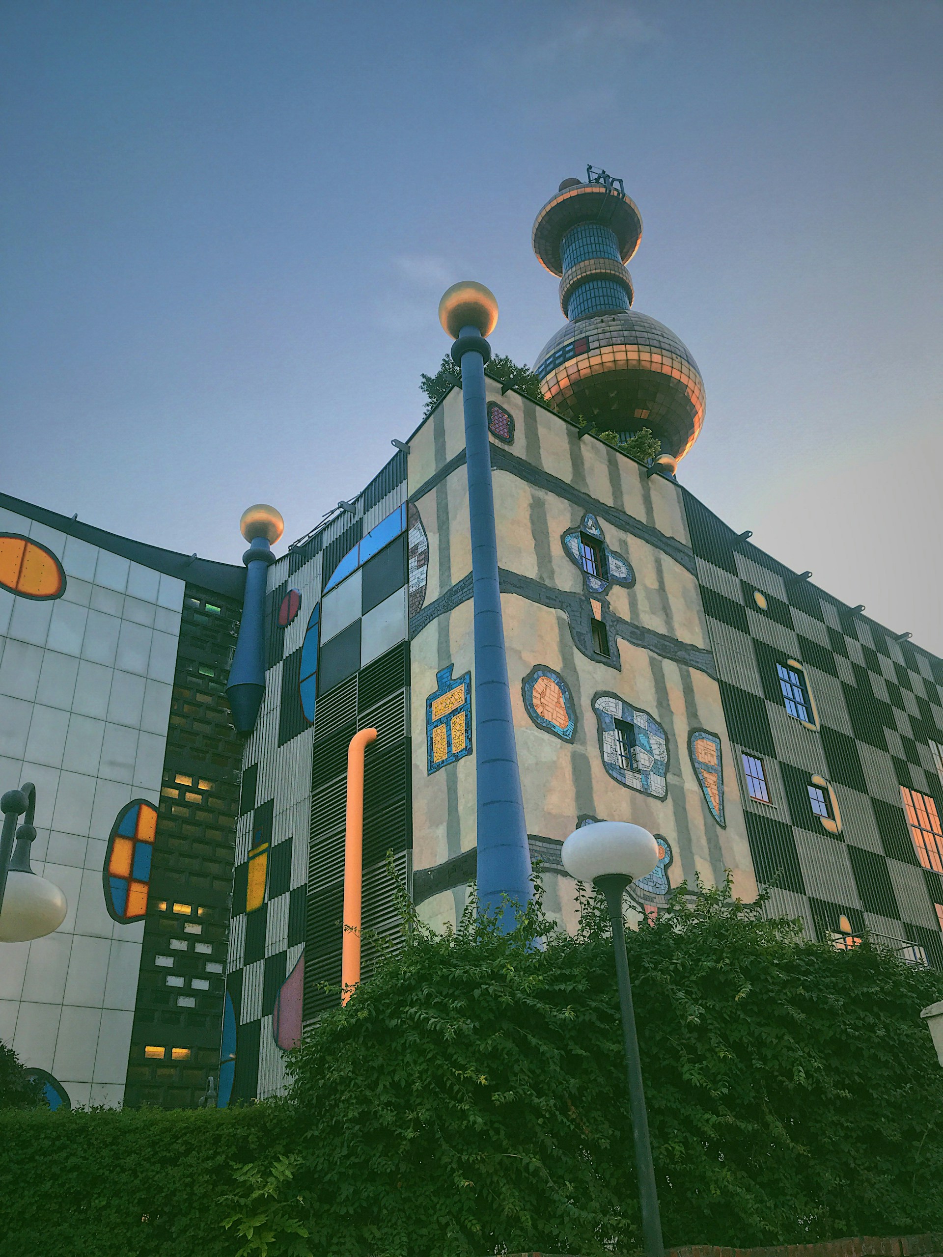 Photo by Dmytro Shchetynin on Unsplash
FYI, this building was designed by Friedensreich Hundertwasser who is known for this style. I’m not saying everything should look like this; we’d run into the same problem, after all. I’m just saying I think we need more of this in a world of neutral tone buildings. Maybe it’s not the outside of your house, but the inside! Or, make something whimsical that normally wouldn’t be, like a light switch. I don’t know, but for crying out loud, do something original!
Where do we go from here?
I think we need more people studying UX/UI design. And I’m not talking about how to round corners; I’m talking about old school System 7 UX/UI. Let’s take a step back to think about when a cursor should be a pointer or not (keep this in mind as you go along your week; you’ll start to notice that it makes no sense). Let’s throw out the idea that backgrounds can only be white, black, or some barely different shade of either of them. There’s a movement online to bring back the “small web”, which is super cool and you should take some time to check it out if you don’t know what I’m talking about, but the main driving force of that movement is not better UX/UI design, instead the main driving force is nostalgia. We’re just reverting back to how it used to be. While that comes with benefits, like being able to read text on a webpage again, you have to admit that some of those pages look pretty awful. I love the spirit though! In the end, that’s what matters.
By the way, I know it seems like I’m being a hypocrite here, considering this site is exactly the thing I’m defaming. But one thing I want to point out is that this site is effectively a digital book. My point is not that simplicity is useless; rather, it’s that we should actually put thought into why something looks the way it does instead of just making the same UI for everything. Some things should be simple, but we should also recognize where we can take artistic liberties, and make life just a bit more fun.
-
I tried the Minimal Phone which was going to be my last phone. I saw mixed reviews about the company themselves (shipping issues, late emails, etc.), but nothing about the hardware. I’m daily-driving it for the first day and all of a sudden the fingerprint sensor stops working. I look it up and apparently this is just something that happens. That’s unfortunate, because the authenticator app I use for work requires biometric authentication, so I’m out already. But then my fiance calls me, I try to pick it up and it immediately drops - “server unreachable”. What?? So I walk into my house, connect to the WiFi, and try to call back. Same deal. Needless to say, it didn’t stick around for long. ↩︎
-
To give them credit, it actually looks pretty good. They haven’t overdone it, which I appreciate. Regardless of the fact that I think it looks good, they’ve still done the exact same thing as everyone else. ↩︎